The Release Dashboard: What Is About to Go to Production
The three GitHub collectors are done. The remaining articles in this series are the dashboards they feed, and there are five of them, because one board trying to answer every delivery question turned into twenty-eight panels that nobody could navigate.
I split it by question. Release is “what is about to ship and did the pipelines work”. Sprint is “how is the current iteration going”. Delivery is “who has what and what is stuck”. MVP is “are we done yet”. Developers is “what is everybody producing”. Each one is small enough to read at a glance, which is the only test that matters for a board on a wall.
This article is Release. Fourteen panels, refreshing every five minutes.
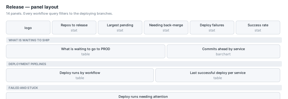
The split that makes this board coherent
Every panel here filters workflow runs the same way:
GitHubWorkflowRunsLatest
| where Branch in ("develop", "main")
That is the whole organising idea. Our CI/CD is branch-driven: merging to develop builds and pushes an image to the dev environment, merging to main does the same for production, and the infrastructure Terraform runs from the platform repository on the same branches. Runs on those two branches are deploys. Runs on feature branches are the build-and-review loop, and they belong on the Delivery board.
The data supports the split cleanly. Over a day: 70 runs on develop, 3 on main, and 81 on feature branches. Two different populations with two different audiences.
Before this split, a single “failed runs” number was dominated by feature-branch noise. One agent branch had failed the same smoke test five times, which is a developer’s problem and not a release concern, and it made the release health look worse than it was.
The headline strip
Five stats, each a single line over a saved function.
GitHubDivergenceLatest | where HasUnreleased | summarize Value = count()
GitHubDivergenceLatest | summarize Value = max(AheadBy)
GitHubDivergenceLatest | where NeedsBackMerge | summarize Value = count()
GitHubWorkflowRunsLatest
| where Branch in ("develop", "main") | where IsFailed
| summarize Value = count()
GitHubWorkflowRunsLatest
| where Branch in ("develop", "main") | where IsComplete
| summarize Value = round(100.0 * countif(IsSuccess) / count(), 1)
Repos to release, largest pending release, needing back-merge, deploy failures, deploy success rate.
Two things worth pointing at.
Success rate is over completed runs only. | where IsComplete before the division. Without it, a run that is currently in progress counts in the denominator as a non-success and the rate dips every time somebody merges. That produces a number that drops when the team is working, which is precisely backwards.
Back-merge has its own tile. NeedsBackMerge is BehindBy > 0: commits on main that develop does not have. Thresholds are tight, amber at one and red at three, because unlike release size there is no healthy non-zero value. It means a hotfix went straight to production and was never merged back, so the next release from develop will revert it. That is a correctness risk and it deserves separating from “how big is the next release”, which is a scheduling question.
What is waiting to go to PROD
The main table.
GitHubDivergenceLatest
| where HasUnreleased or NeedsBackMerge
| order by AheadBy desc
| project Service = Repository,
          ['Commits ahead'] = AheadBy,
          ['Files'] = FilesChanged,
          ['Behind main'] = BehindBy,
          ['Days since last commit'] = UnreleasedDays,
          Status
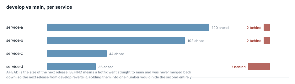
Commits ahead is the size of the next dev-to-production push. Colour-background gradient, amber at 30 and red at 75. Those thresholds are set to catch the tail rather than the median: when I built this, the two largest were 120 and 102 commits, and a threshold at the median would have coloured everything.
Files is the other half of “how big”. A hundred commits across eleven files is a different review than forty-four commits across two hundred and thirty-six.
Days since last commit comes from the newest commit on the head branch. It is what separates “a big release we are actively building” from “a big release that has been sitting for three weeks”, and those want very different conversations.
Status is GitHub’s own word for the comparison: ahead, behind, diverged or identical. It is redundant with the two numeric columns and I kept it because it reads faster than comparing two integers.
The filter is HasUnreleased or NeedsBackMerge, so a repository that is exactly in sync drops off the table entirely. The panel is a to-do list, and a service with nothing to release does not belong on it.
Repositories with no develop branch are absent rather than zero, which is the collector-side decision from two articles ago. A zero would read as “nothing to release” when the truth is “not on the release train”.
Commits ahead by service
The bar chart beside the table.
GitHubDivergenceLatest
| where HasUnreleased
| top 12 by AheadBy desc
| order by AheadBy asc
| project Service = Repository, ['Commits ahead'] = AheadBy
top then order again, for the same reason as the FinOps chart: top selects the twelve, the subsequent order controls the direction they are drawn.
Continuous colour rather than a palette, so the size of the bar and its colour carry the same information and the eye lands on the biggest one first.
Deploy runs by workflow
GitHubWorkflowRunsLatest
| where Branch in ("develop", "main")
| summarize Runs = count(), Failed = countif(IsFailed),
            Services = dcount(Repository), Last = max(UpdatedAt)
        by Workflow = WorkflowName, Branch
| order by Runs desc
This is the panel that shows all three of our pipeline types in one place: the image build and push that runs on the service repositories, the frontend deploy, and the infrastructure Terraform runs on the platform repository.
Grouped by workflow and branch together, which is not optional. The same workflow name means dev on develop and production on main, so collapsing them would merge two different pipelines into one row and average their failure rates.
Services = dcount(Repository) tells you how widely a workflow runs. A build-and-push workflow appearing across seventeen repositories is the shared pipeline working; the same workflow appearing on one is either a new service or a broken rollout.
Last successful deploy per service
GitHubWorkflowRunsLatest
| where Branch in ("develop", "main")
| where IsSuccess and WorkflowName has "Push Image"
| summarize LastDeploy = max(UpdatedAt) by Service = Repository, Branch
| extend ['Hours ago'] = datetime_diff('hour', now(), LastDeploy)
| order by LastDeploy desc
When did each service last actually ship.
The has "Push Image" filter is the one thing on this board I am not entirely happy with, because it matches on a workflow name and workflow names are prose. If somebody renames the workflow, this panel silently empties. The alternatives were worse: a hardcoded list of workflow ids goes stale differently, and there is no “this workflow deploys” flag in the API to key off. I settled for the name match and a note on the panel, and if it becomes a problem the fix is a naming convention enforced in the workflow templates rather than a cleverer query.
The panel description carries the important caveat: a service missing from this list has not had a successful image push inside the collection window. That is either quiet or broken, and the failures table below says which. An absence here is meaningful, which is the opposite of the usual case and worth writing down.
Deploy runs needing attention
GitHubWorkflowRunsLatest
| where Branch in ("develop", "main")
| where IsFailed or IsInFlight
| extend When = coalesce(UpdatedAt, CreatedAt)
| order by When desc
| project Service = Repository, Workflow = WorkflowName, Branch, Event,
          Outcome = iff(IsInFlight, strcat("running ", tostring(WaitingMinutes), "m"), Conclusion),
          Actor, When, Url
Failures and anything still in flight, in one table.
The Outcome column collapses two different states into one readable string. A failed run shows its conclusion, failure or timed_out. A run still going shows how long it has been going: running 47m.
That second case is why in-flight runs are on this panel at all. A run stuck at forty-seven minutes is almost always a runner that never picked it up, and on a board it looks nothing like a red test. Without the minutes it would just be a row that says “in progress” forever, which reads as normal.
Url is projected and then hidden by a field override, so the workflow name can be a click-through to the run without spending a column on a URL nobody reads:
{
  "matcher": { "id": "byName", "options": "Workflow" },
  "properties": [{
    "id": "links",
    "value": [{ "title": "Open in GitHub", "url": "$${__data.fields.Url}", "targetBlank": true }]
  }]
},
{
  "matcher": { "id": "byName", "options": "Url" },
  "properties": [{ "id": "custom.hidden", "value": true }]
}
The doubled dollar sign is the templatefile() escape from the first article in this series.
What this board found on day one
Worth recording, because it is the argument for building it.
One service was 120 commits and 203 files ahead of main. Another was 102 and 130. Nobody had a number for that before, and “we should probably do a release soon” had been the state of knowledge for a while.
Two services were behind main by seven and four commits, meaning hotfixes had gone straight to production and never come back down.
And one framework repository had failing tests on main itself, which is the branch that deploys to production. That had been true for some time and was not visible anywhere.
None of those needed new instrumentation. They needed somebody to ask the API and put the answer on a wall.
Conclusion
The design decision that makes this board work is the branch filter, and it is worth stating plainly because it is not obvious until you have a mixed board and cannot read it. Deploy pipelines and build pipelines have different audiences, different acceptable failure rates and different urgency, and putting them on one chart means the noisier one drowns the more important one.
The other thing I would repeat is separating AheadBy from BehindBy rather than showing a single divergence number. They are both “these branches differ” and they mean opposite things: one is work waiting to ship, the other is production carrying a fix that development has lost. A single number would have hidden the second entirely. The next article is the Sprint board, where the burn-down needed a denominator that the API does not give you directly.