The Dashboard That Needed No Extractor
In the first article of this series I laid out the pattern we use to get business data into a Log Analytics workspace so that Grafana can chart it. A scheduled job, a shell script, the Logs Ingestion API, a custom table, a saved function. Three of our four dashboards are built that way.
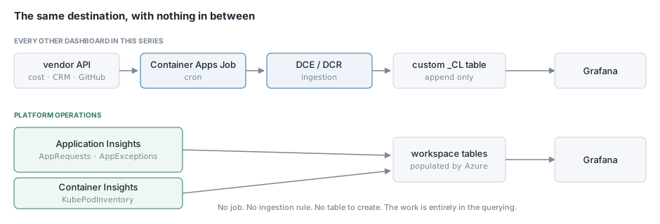
This one is not, and I want to start here precisely because of that. Our Platform Operations dashboard is the oldest board we have and the one that gets looked at the most, and it has no collector behind it at all. Every table it reads is populated by Azure Monitor whether we do anything or not. Before you write a pipeline it is worth spending an afternoon finding out how much of your question is already answerable, because in our case the answer was most of it.
This article covers what Azure gives you for free, and the four techniques that turned those raw tables into something readable on a wall-mounted screen. The next article walks the finished dashboard panel by panel.
What Azure Monitor already collects
If you have Application Insights wired into your services and Container Insights enabled on your AKS cluster, you already have these, and you did not have to write anything to get them.
AppRequests is one row per HTTP request handled by an instrumented service, with a duration and a success flag. That single table answers request rate, error rate and latency percentiles.
AppExceptions is one row per unhandled exception, with the type and the stack.
AppAvailabilityResults is one row per availability test run, which is how we watch the two static sites that have no pods to inspect.
KubePodInventory is a periodic inventory of every pod in the cluster with its status. This is the one people forget they have. It is not a metric, it is a table you can group and count, which makes “is every pod of this service ready” an ordinary KQL question.
AppTraces and AppEvents hold whatever your own code writes through the Application Insights SDK. These are the escape hatch for anything Azure cannot see, and I will come back to them.
Between them, that is request health, exception volume, site availability, pod readiness, and a channel for your own domain measurements. There is quite a lot you can build before you need an extractor.
Step 1: Decide how you will tell environments apart
We run two environments in two different subscriptions, and I wanted one dashboard rather than two, because a wall display that only shows half the estate is a wall display somebody has to walk over and change.
The Azure Monitor data source in Grafana lets a single log query span multiple workspaces if you list them as resources on the target. Once you do that, rows from both environments arrive in the same result set, and you need a way to label them. _ResourceId is present on every row and contains the resource group and resource name, so:
| extend env = iff(_ResourceId has "prod", "prod", "dev")
It is crude, it depends on a naming convention, and it has worked without incident for a year. Every panel on this dashboard starts with some version of that line.
There is one thing this does not work for, and it caught me out. Log queries can span subscriptions. Azure Monitor metric queries cannot, because a metric target names a specific resource. Our Cosmos DB and AKS node panels are metrics rather than logs, so those panels carry one target per environment instead of one query that covers both. The panel holds both series, but the multi-subscription trick happens at the panel level rather than inside the query.
Step 2: Seed the results so absent things still appear
This is the technique I would most like people to take away from this article, because it fixes a class of bug that is very easy to ship and very hard to notice.
It is also the thing I spent the most time on in a previous life. At Microsoft I worked on synthetic health signals for Azure, and a large part of that job was arguing about what a signal should report when it has nothing to report. It sounds like a philosophical question and it is an entirely practical one, because the default behaviour of almost every aggregation you will write is to omit the thing that is missing, and missing is frequently the interesting case.
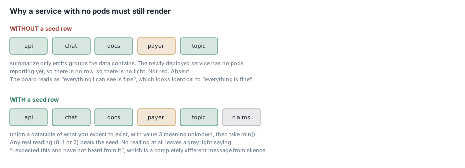
Our health panel has one light per service. The data comes from KubePodInventory, grouped by service, and it works exactly as you would hope. Then we deployed a new service, and it did not appear on the dashboard. Not red, not yellow. Absent.
The reason is obvious once you see it. summarize only emits groups that exist in the data. If a service has no pods reporting yet, there is no row, so there is no light. The dashboard was showing “everything I can see is fine”, which reads identically to “everything is fine” and means something completely different.
The fix is to union a seed table of the things you expect to exist, with a value meaning “unknown”, and then let real data override it:
let seed = datatable(Series:string, Value:long, Ord:long)
  ["dotcom", 3, 0, "frontend", 3, 0, "claims", 3, 1, "risk", 3, 1];
let services = KubePodInventory
  | where TimeGenerated > ago(15m)
  ...
  | project Series = svc, Value, Ord = tolong(1);
union seed, services
| summarize Value = min(Value) by Series, Ord
| order by Ord asc, Series asc
| project Series, Value
Two details make this work. The seed value is 3, which our thresholds render as grey for unknown, and it is deliberately higher than every real state. Real states are 0 for down, 1 for degraded and 2 for healthy. Taking min() across the union means that if real data exists for a service it always wins, because any real value is lower than the seed. If no real data exists, the seed survives and you get a grey light saying “I expected this and I have not heard from it”, which is a completely different message from silence.
Ord is a sort key that comes along for the ride. Sites measured by availability test get Ord = 0 and services measured by pod inventory get Ord = 1, so the two groups stay clustered rather than interleaving alphabetically. Ordering by Ord then Series gives a stable layout, which matters more than it sounds on a screen people glance at rather than read.
We use the same seed pattern anywhere a summarize could legitimately produce nothing. Our content volume table seeds both environment rows so that a quiet environment shows zeros instead of vanishing, and the sign-in table does the same.
Step 3: Collapse related pods into one light
Most of our services deploy as two things, an API and a worker, from the same codebase. On a health dashboard I want one light per service, not two, because I care whether the service is functioning and not about the deployment topology.
Pod names look like contract-7d9f8b6c4-x2n8p, and a worker is contract-worker-5f6a8c9d2-k4m1q. Pulling the service name out is a regex and a suffix strip:
| extend svc = extract(@"^(.*?)-[0-9a-f]{8,}-", 1, Name)
| where isnotempty(svc)
| extend svc = replace_regex(svc, @"-worker$", "")
The first expression takes everything before the ReplicaSet hash. The second folds contract-worker into contract. After that the readiness rollup is per service rather than per deployment:
| summarize arg_max(TimeGenerated, PodStatus) by env, svc, Name
| summarize ready = countif(PodStatus == "Running"), total = count() by env, svc
| extend state = tolong(case(ready == 0, 0, ready < total, 1, 2))
The arg_max on the inner summarize matters. KubePodInventory is a periodic inventory, so a single pod appears many times across the window with whatever status it had at each sample. Without taking the latest row per pod you are counting samples rather than pods, and a pod that was restarting an hour ago drags the number down forever.
The case gives three states: none ready is red, some ready is amber, all ready is green. Green only when every pod of that service is up. That is a deliberately strict definition and it has caught real partial outages that an “at least one pod is up” check would have shown as healthy.
Step 4: Instrument what Azure cannot see
Azure Monitor knows about requests, exceptions and pods. It does not know how many contracts are in your system, or how many documents you have processed, because those are facts about your domain rather than your infrastructure.
For that we use AppEvents. Our workers periodically publish a gauge through the Application Insights SDK, and the dashboard reads it back:
AppEvents
| where Name == "ContractInventory"
| extend K = tostring(Properties.TenantId), V = toint(Properties.Count)
| summarize arg_max(TimeGenerated, V) by Env, K
| summarize Val = sum(V) by Env
There is a subtlety in those two summarize lines that is worth dwelling on, because it is the same append-only problem the rest of this series is about, in a place you might not expect it.
These events are gauges, republished on every worker run. The current value for a tenant is the most recent event for that tenant, not the sum of all events for that tenant. So you take arg_max per key first to get the latest reading, and only then sum across keys to get the total. Get that backwards and your contract count grows every time a worker runs, which looks like healthy growth right up until somebody counts them by hand.
The distinction I use to decide is whether the thing is a gauge or an occurrence. Gauges go in AppEvents and get arg_max. Occurrences, like a user signing in, go in AppTraces and get counted. Our sign-in panel reads AppTraces and just counts, because each sign-in is its own fact and there is nothing to supersede.
Step 5: Make every number a way in
A summary dashboard is where you notice a number looks wrong. It is a bad place to find out why. So most of the panels on this board are links to a deep dive.
Grafana’s field-link override does this, and the escaping is the fiddly part:
{
  "matcher": { "id": "byName", "options": "Series" },
  "properties": [{
    "id": "links",
    "value": [{ "title": "Service detail", "url": "/d/service-$${__data.fields.Series}" }]
  }]
}
${__data.fields.Series} is Grafana’s own interpolation, and because this JSON is a Terraform template, templatefile() would try to resolve it as a Terraform variable and fail the plan. Doubling the dollar sign escapes it.
The other half of making that work is a naming convention. Every generated service dashboard has a UID of service-<name>, so the health pills can link to any of them with one rule instead of a lookup table. That convention is worth setting up early, because it means the drill-down keeps working when you add a service.
Which brings me to a mistake worth repeating. The per-service dashboards are generated one per entry in a Terraform variable, and that variable is meant to mirror the service list in another layer. It drifted by three. Three services were deployed, had pods, showed a green light on the health panel, and linked to a dashboard that did not exist. Nobody noticed for weeks, because you only find out by clicking the light of a service that is working fine. If you build a drill-down by convention, put something in CI that checks the two lists match, or accept that it will silently rot.
Conclusion
The reason I wanted to open the series with this dashboard is that it is the counter-example to everything that comes next. Three articles from now I will be talking about Container Apps Jobs and data collection rules and ingestion endpoints, and it would be easy to come away thinking that is what you need in order to build a dashboard. For a large amount of what we wanted to know, it was not. Application Insights and Container Insights were already collecting the data, and the work was entirely in the querying.
If there is one technique here to steal it is the seed table. A dashboard that silently omits the thing that is broken is worse than no dashboard, because it is actively reassuring, and summarize will do exactly that to you by default. Unioning in a table of what you expect to exist, with a value that says “unknown” and loses to any real reading, costs three lines and turns silence into a grey light. The rest of this series is about getting data into the workspace. This article is the reminder to check whether it is already there.